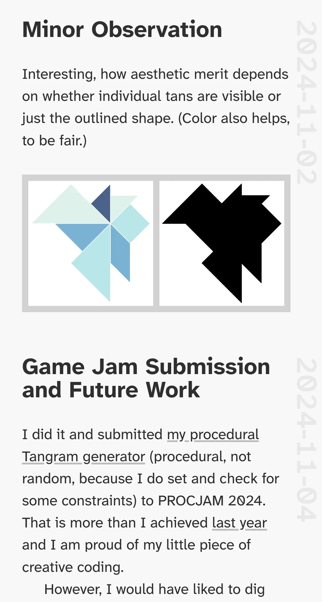
Redesign 2025
I restarted this website in 2023 to prove to myself that I can keep up a steady stream of written ouput … that I have something to offer and that blogging is fun… nay, necessary again. 94 notes later, I consider this trial period done and a success! It’s high time to turn this list of blog posts into an actual personal (and professional) website. Welcome to my Redesign 2025!
This redesign is heavily fueled by two of my absolute web heroes: Andy Clarke and Jen Simmons! I will go into depth of why I adore these two beacons of the web development community in a separate post. For now it suffices to know that they are two of the few who have constantly pushed the limits of visual storytelling and art direction on the web. I too feel the urge to do something else than a centered column of text with some full-bleed imagery—there’s got to be more to modern web design!
Two points will guide my work on this website:
- Don’t be boring! Be bold! Tell a story! Invoke emotions!
- CSS offers a plethora of powerful tools. Use them!
My sources of inspiration:
- Art Direction for the Web by Andy Clarke. The book that started it all.
- Inspired by CSS Grid at State of the Browser 2019 is an excellent talk that goes well with the book. One of my favorites, but you can’t go wrong with any of Andy’s talks.
- The Experimental Layout Lab of Jen Simmons. She calls it an era of graphic design on the web.
- Editorial Design – Digital and Print by Cath Caldwell. Full of beautiful inspiration.
Step 1: Notes in Small Viewports
This website is and probably always will be 90% notes/blog posts/articles. Whatever you wanna call it, it’s a bunch of text that should be easy to read. That’s why I decided to switch from system fonts to the Hyperlegible Fonts by the Braille Institute; a beautiful font family with some variable versions that give me the perfect excuse to play around with variable fonts.
When people open one of my notes I want them to feel invited, drawn in by the text, cozy as if they were browsing through a friend’s notebook, with loose polaroids and old receipts flying around. However, I cannot leave my love for a minimal and clean look behind just yet. Combining coziness and minimalism will be a challenge. Luckily, I decided to do my redesign small-viewports-first and won’t have to deal with this dichotomy for now, as designing for small screens is all about effective use of limited screen real estate. As you can see on the left image below, I have been doing a poor job on that: The beautiful image takes up a huge portion of the viewport, but is so cropped that it can’t fully unfold; the headline takes up too much space; the most important part—the body of text—is squished at the bottom and you can barely read the first sentence.
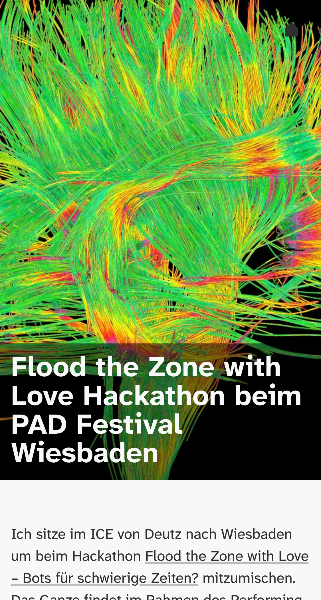
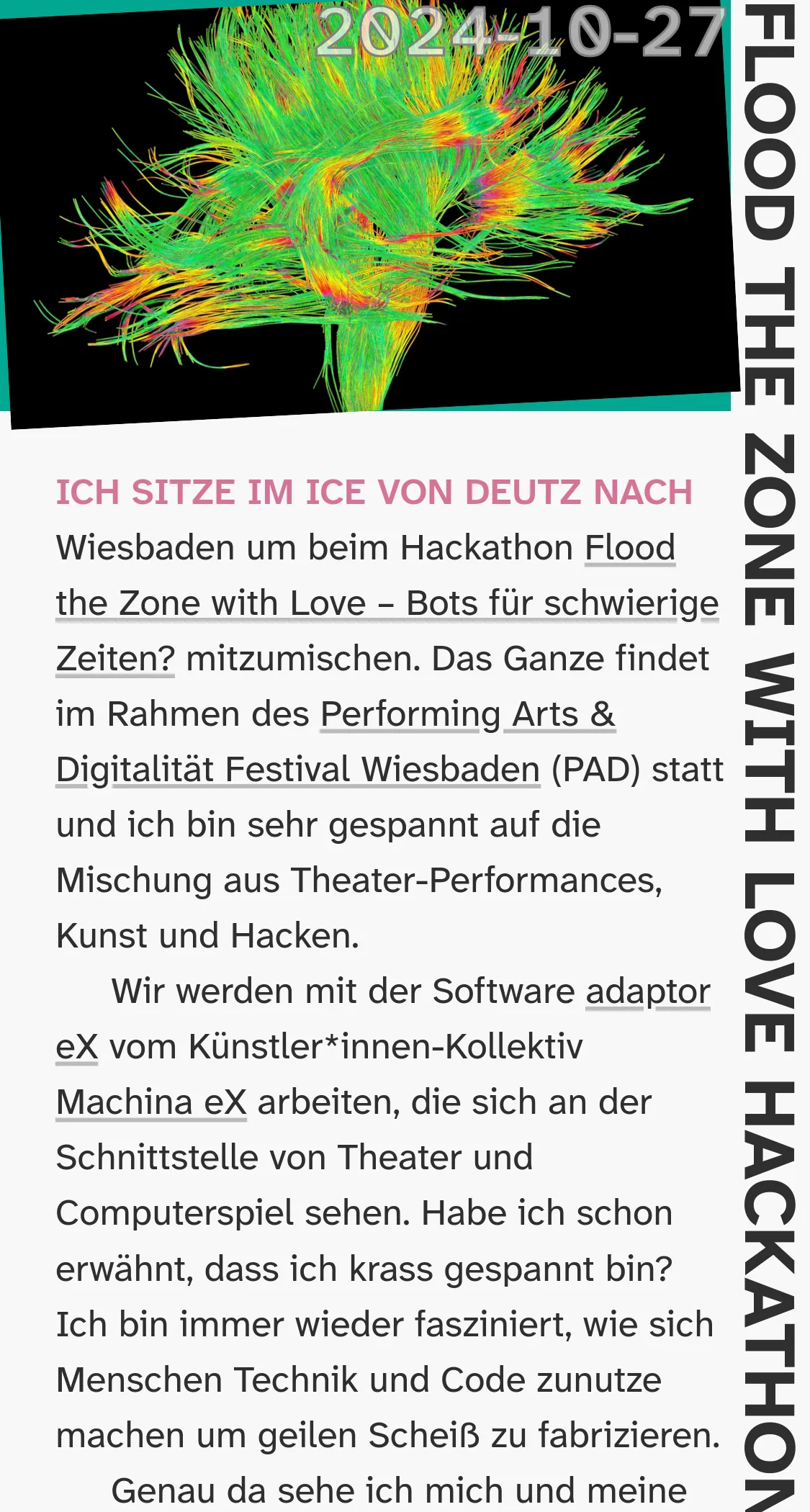
My first attempt on the right establishes some of the ideas I had: For starters, who cares about the title? You probably read the title when you clicked the link, right? So I decided that the title can move aside. It’s still there and accessible, just not in a prominent spot. That spot is reserved for the content, of which one can see a lot more now. Also, the featured image is not cropped but shown in its full beauty. I am not too concerned about it being too small as zoom on small viewports tends to be fast and easy. I also rotated the image slightly to make it seem as if somebody had thrown it in. I am not happy with the date, but I want it to take this prime spot. You know, other than most bloggers I know, I try to keep my notes up-to-date and mend them over time. I want a reader to know from when a note is. That’s why the date—updated, not created—should be there right with the title.
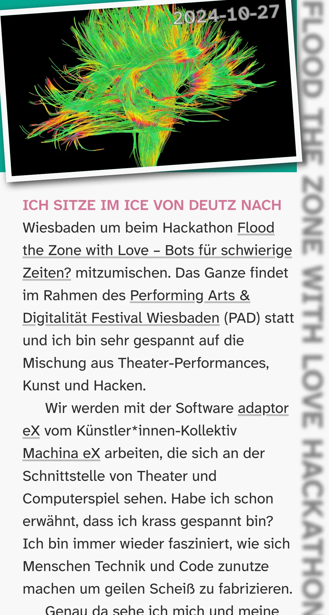

For the final design, I added a white border to give the header image a polaroid-like appearance to further the notebook vibe. I also rotated the date which reminds me of the time code that sometimes got embossed onto developed photos back in the day. If there is a feature image, I put a blur filter on the title to decrease its visual weight. I hope that the styled first line of text and the bottom left corner of the tilted image guide a reader’s eye to the start of the article. I am quite happy with the small viewport design for my notes page and how it works for portrait images, too. Definitely a huge improvement over the old version.
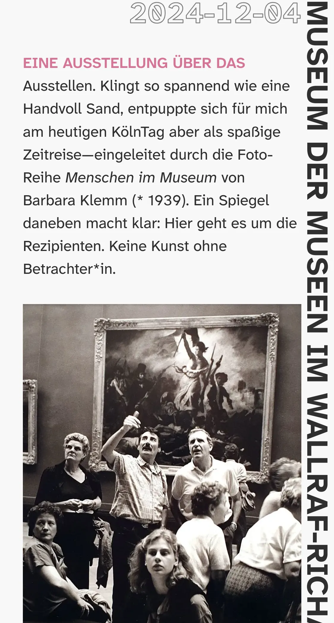
Left: I also like how well the design works without a header image but with images in the content. The unblurred title and update date create a nice frame for the article body. Right: Here I showcase how note updates are rendered with the update date on the side of the H2 header, just like the main title at the beginnig of the note. I am starting to really like “tucking” away secondary information that way.